PlaySpots Sports Venue Booking Application
I played a key role as a UI/UX Designer for PlaySpots, a sports venue booking app. My responsibilities included designing an intuitive interface for discovering and booking sports venues, simplifying the booking journey, and creating a seamless experience for players of all skill levels.
Client
Playspots
Year
2026
Role
UI/UX Designer
Project Overview
PlaySpots is a sports venue discovery and booking platform built for sports enthusiasts across Kerala. I worked on redesigning the existing PlaySpots Lite application to make venue discovery faster, simplify the booking journey, and make offers, rewards, and upcoming activities more accessible.
Focus: UX Research, Product Strategy, Information Architecture, Interaction Design, UI Design, Prototyping, Design System
Tools: Figma, FigJam, Miro
Collaborated with: Product Team, Developers, Venue Partners
The Challenge
As PlaySpots Lite evolved, the booking experience accumulated usability issues that made discovering venues and completing bookings more complicated than necessary.
Key challenges included:
Too many steps between discovering a venue and completing a booking.
Limited visibility of available slots and essential booking information.
Inconsistent navigation and information hierarchy.
Offers and rewards were difficult to discover.
Users had to navigate through multiple screens to check upcoming bookings.
The challenge was to simplify the experience without losing the features that mattered to users and the business.
Research & Discovery
Before redesigning the interface, I explored the existing product through product audits, stakeholder discussions, competitive research, and user interviews.
I studied competitors like Playo, Hudle, and KheloMore to understand familiar booking patterns and identify opportunities to improve the experience.
Key Insights
Users wanted to find nearby available grounds, compare options, discover offers, and book quickly without navigating through unnecessary steps.
This insight shaped the redesign around three priorities:
Discover: Make nearby venues and availability easy to explore.
Book: Reduce friction throughout the booking journey.
Return: Make rewards, offers, and upcoming activities more visible.
The Solution
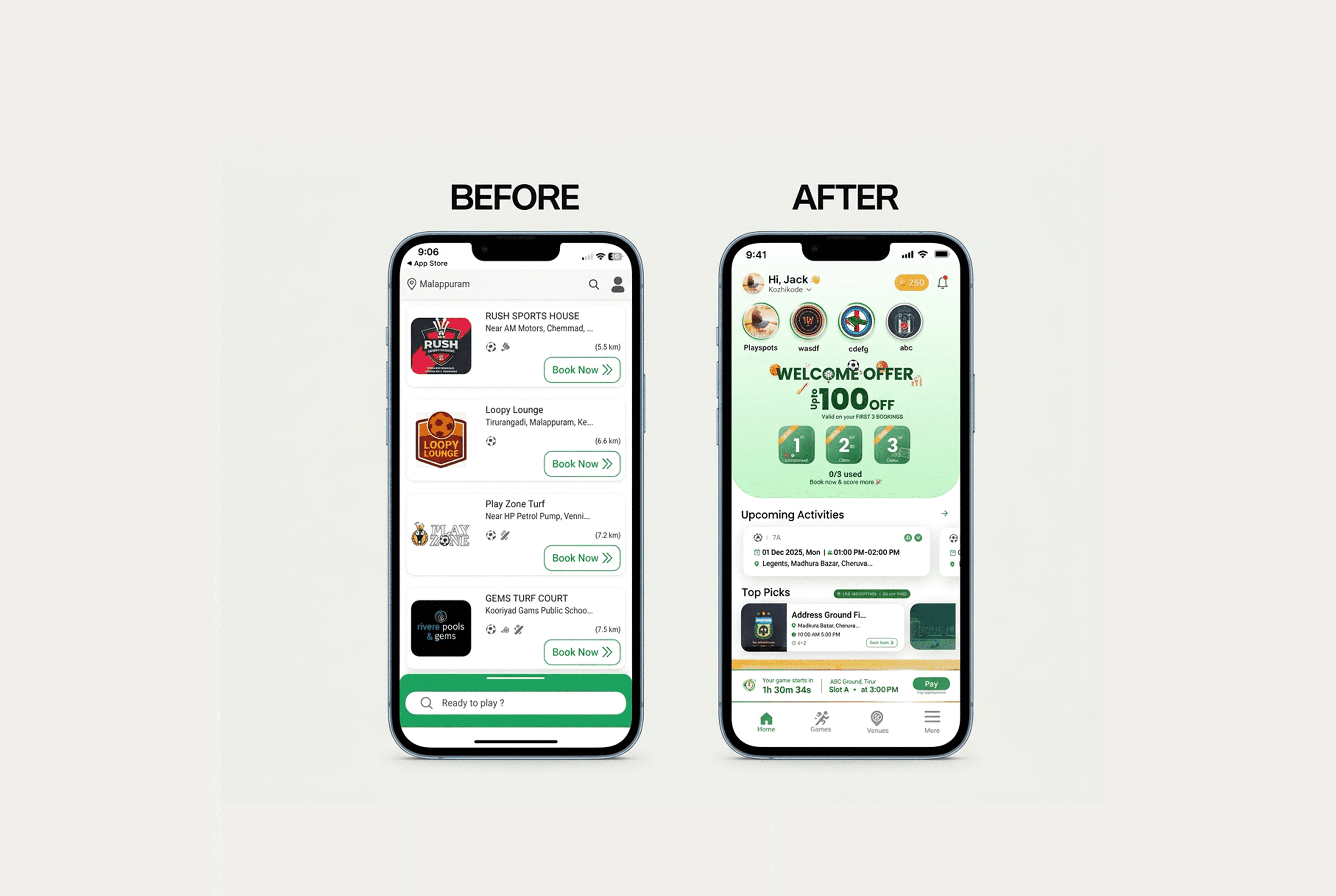
I redesigned the experience around a more intuitive home screen and a streamlined booking journey, bringing important information closer to where users needed it.
1. A More Useful Home Screen
I restructured the home screen to make venue discovery, offers, and upcoming bookings more accessible.
Stories: Help venue partners showcase offers, tournaments, facilities, and available slots.
Welcome Offer: Highlighted the first-time user offer and its availability across the first three bookings.
Upcoming Activities: Displayed booking details, match times, venue information, and payment status directly on the home screen.
These changes helped users discover relevant information and manage their bookings with fewer steps.
2. A Simpler Booking Journey
I mapped and refined the booking flow to reduce unnecessary interactions and improve clarity at every stage.
Discover → Select Venue → Explore Details → Choose Date & Slot → Review → Pay → Confirm
The redesigned flow prioritised availability, pricing, and essential booking details so users could make decisions with less effort.
3. A Consistent Visual Experience
I refined the visual hierarchy to make the interface easier to scan and navigate.
Retained green as the primary colour to maintain brand consistency and highlight key actions.
Used prominent venue imagery to support faster recognition.
Improved typography, spacing, and information hierarchy.
Made availability, pricing, and booking details easier to identify.
Key Design Decisions
Stories for Venue Updates: Made promotions, tournaments, and venue information easier to discover.
Welcome Offer on the Home Screen: Increased visibility of first-time rewards and repeat-booking incentives.
Upcoming Activities: Made booking details and upcoming matches accessible directly from the home screen.
Simplified Booking Flow: Reduced unnecessary steps between venue discovery and booking confirmation.
Reusable Design System: Improved design consistency and supported future product growth.
Impact & Outcome
The redesign established a clearer, more streamlined booking experience focused on helping users discover venues, understand availability, and complete bookings with less effort. It also improved the visibility of offers, rewards, and upcoming activities while creating a more consistent and scalable foundation for future product development.
The redesign focused on improving the user experience; quantitative performance results were not available.
Reflection & Key Learnings
Working on PlaySpots taught me that good product design starts with understanding user behaviour, not simply refreshing the interface.
I learned to:
Translate user research into practical product decisions.
Balance user needs, business priorities, and technical constraints.
Simplify complex workflows through better information hierarchy.
Design reusable systems that support consistency and scalability.
Collaborate closely with stakeholders and developers throughout the design process.
The biggest takeaway: Successful product design isn't about adding more features. It's about helping users achieve their goals with less effort.