Kenza Rewards


Category:
Mobile App Design
Client:
SoftFruit Solutions
Duration:
3 weeks
Kenza Rewards is a loyalty platform that enables contractors and steel dealers to earn points by uploading GST invoices and redeeming rewards. The project focused on redesigning the complete reward journey, making every stage from invoice submission to redemption clear, transparent, and easy to understand.
Overview
Kenza Rewards is a mobile application designed to give contractors, dealers, and steel purchasers a clear, trustworthy way to earn and redeem rewards on their purchases. Users upload GST invoices, earn points once those invoices are verified, and redeem points for tangible rewards.
The challenge was to design a points-based loyalty system for a professional, high-frequency purchasing audience, most of whom were 30 years or older and expected simplicity over novelty.
The Problem
Loyalty programs only work if users trust them. For contractors and dealers purchasing steel regularly, that trust depends on one thing: knowing where they stand.
User research and stakeholder discussions surfaced a recurring pain point: users upload an invoice and then wait, with no visibility into what happens next. Was the invoice received? Is it under review? How many points until the next reward? Without answers to these questions, a rewards program stops feeling like a benefit and starts feeling like a black box.
The design challenge: build a system where every stage of the rewards loop upload, verification, points, redemption is visible, understandable, and motivating from day one.
Strategy: Designing for Trust Through Transparency
The product strategy centered on a single insight — trust is built through visibility, not persuasion. Every screen needed to answer one implicit question for the user: "What's happening right now, and what happens next?"
This principle shaped three core areas of the product.
1. A step-by-step invoice flow with live status
Rather than treating invoice upload as a single, opaque action, I designed it as a trackable journey. After submission, users see a clear status card:
Submitted → Under Review → Verified → Points Added
complete with estimated timeframes at each stage. This turns an invisible backend process into something that feels like a progress bar the user can actually trust.
The upload interaction itself was designed as a guided three-step flow: photograph or select the invoice, confirm the details, submit. Inline validation and clear error states were built in from the start to prevent silent failures a common source of user drop-off in document-upload flows.
2. A home screen built around momentum
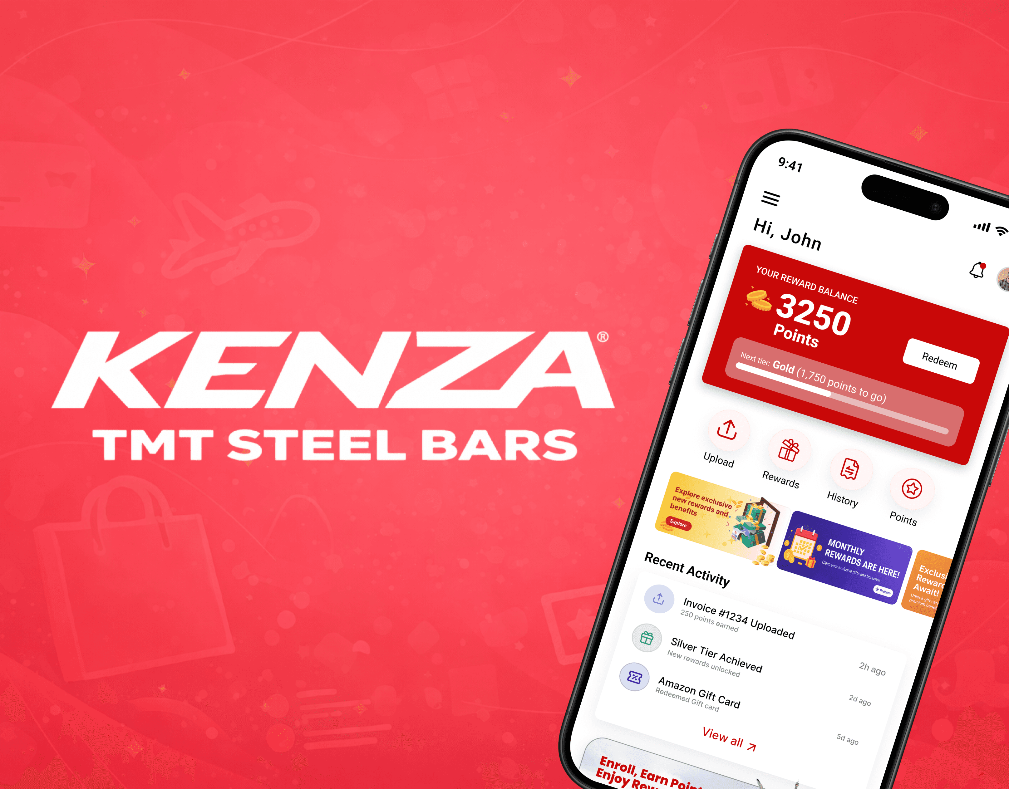
The home screen was designed to lead with the number that matters most: the user's current point balance, front and center. Below it, a visual progress indicator shows exactly how many points stand between the user and their next reward tier, and a recent activity feed ties specific invoices to the points they earned.
The goal was to shift the emotional tone of the app from uncertainty to anticipation users should always know where they stand and what they're working toward.
3. A redemption catalogue designed to convert
For a rewards app, the redemption moment is where trust either pays off or falls apart. I designed the catalogue around clarity of achievability: rewards are organized by point cost, with a clear "You can redeem this" indicator based on the user's live balance. Categories gift cards, electronics, travel are filterable, and locked items carry a persistent "Points needed" label that motivates future purchases instead of discouraging present engagement.
Process: From Paper to Pixel
The product moved through three fidelity stages:
Lo-fi wireframes — to validate core flows and information architecture with stakeholders
Mid-fi prototypes — to test navigation patterns and task flow logic
Hi-fi screens — to finalize visual design, colour logic, and micro-interactions ahead of handoff
Designing for an audience aged 30+ shaped every decision along the way. UX research on this demographic points to a strong preference for minimal interfaces, predictable flows, and fast access to essential functions so the priority throughout was clarity over cleverness, at every fidelity stage.
Design System
The visual language was built around a red(C90808), black, gold, and green palette paired with Roboto, with a deliberate colour logic applied system-wide:
#C90808 — brand identity and primary calls to action
Gold — achievement and reward value
This consistency means users learn to read the interface intuitively recognizing status and meaning through colour before they even read the copy. Typography, spacing, and component patterns were standardized into a reusable library to support scalability as the product grows.
Core Components Designed
Primary:
Reward dashboard with clear point visibility
Guided invoice upload flow
Verification status system with real-time feedback
Supporting:
Structured redemption flow for faster decision-making
Browsable, filterable reward categories
Explicit status indicators (pending, approved, rejected)
Results & Impact
Kenza Rewards was designed into a structured, transparent, and trustworthy product replacing ambiguity with a system users could actually follow. By designing specifically for a 30+ audience, the product prioritizes simplicity, clear navigation, and fast access to essential actions over decorative complexity.
Connecting every step of the journey from invoice upload to point verification to redemption reduces confusion at each handoff and gives users the confidence to engage with the platform repeatedly, rather than abandoning it after one uncertain experience.
Key Learnings
Transparency is a feature, not an afterthought. Users don't abandon reward platforms because the reward isn't good enough they abandon them because they can't see the value. Making every stage of the journey visible is itself a product decision, not a UI polish step.
Progress is motivating. Ambiguity is not. A user who knows they're 200 points from a gift card behaves differently from one who has no idea where they stand. Designing for visible progress directly drives the repeat engagement the platform depends on.
Simplicity earns trust faster than aesthetics. Visual polish mattered, but the biggest trust signal in user feedback was a clear, predictable flow. When users know what happens next, they feel in control and users in control engage more.
Colour can carry meaning if used consistently. Applying a deliberate colour logic (red = action, gold = reward, green = success) reduces cognitive load and makes the interface feel cohesive even across very different screens.