PlaySpots

Category:
Mobile App Design
Client:
Playspots
Duration:
5 weeks
I was asked to redesign an app that already worked.
PlaySpots is a sports venue discovery and booking platform built for sports enthusiasts across Kerala.
The project focused on redesigning the existing PlaySpots Lite application into a more intuitive and scalable user experience. While the existing product successfully enabled users to discover and book sports venues, the experience had accumulated usability issues as the product grew.
The goal wasn't simply to modernize the interface. It was to rethink the booking experience around a simple product principle:
Help users find an available venue and book it with as little effort as possible.
The redesign focused on reducing friction, improving venue discovery, making rewards and offers more visible, and creating stronger reasons for users to return to the product.
My role
Role: UI/UX & Product Designer
Focus: UX Strategy, User Research, Information Architecture, Interaction Design, UI Design, Prototyping, Design System
Collaborated with: Product Team, Developers, Venue Partners
Tools: Figma, FigJam, Miro
Starting with the product, not the pixels
The first thing I did was resist opening Figma.
A visual redesign would have been easy to start. It also would have been easy to get wrong.
I first worked with the team behind PlaySpots Lite to understand the product beyond its screens.
Through walkthroughs and discussions, I explored:
Why the existing experience was designed the way it was
What users were already struggling with
Which features mattered to the business
What venue owners needed from the platform
What technical constraints existed
What the product roadmap looked like
Which parts of the existing experience were worth preserving
This helped me separate symptoms from actual product problems.
A screen might feel cluttered, for example, but the underlying issue could be poor prioritisation of information rather than the number of elements on the screen.
That distinction shaped the rest of the project.
Understanding the existing experience
I mapped the end-to-end booking journey to understand where users were being asked to think, navigate, or make decisions unnecessarily.
Discover → Select venue → Explore details → Select date → Find slot → Review → Pay → Confirm
The flow technically worked.
But working and working well are two different things.
I found friction in places where the product was asking users to do more than the task required:
Too many interactions between discovery and booking
Important booking information spread across screens
Inconsistent navigation patterns
Weak hierarchy between primary and secondary actions
Limited visibility of availability
Promotions disconnected from the booking journey
Existing bookings requiring unnecessary navigation to access
The opportunity wasn't to remove complexity blindly.
It was to move complexity away from the user wherever the product could handle it for them.
Researching the problem from multiple angles
I didn't want the redesign to be based on my interpretation of the interface alone. I combined four perspectives:
Product audit
I evaluated the existing application screen by screen and mapped the booking journey to identify usability and information-architecture issues.
Stakeholder conversations
I worked with the product team to understand business priorities, technical constraints, venue-owner needs, existing user feedback, and the future direction of the product.
Competitive research
I studied Playo, Hudle, and KheloMore to understand established patterns around venue discovery, booking, rewards, promotions, and navigation.
It was to understand what users had already learned from similar products and where PlaySpots could create a simpler experience.
User interviews
I spoke with sports enthusiasts across Kerala about how they actually find and book venues.
I explored:
What triggers a booking
How users choose between venues
What information they need before committing
How they check availability
What makes them abandon a booking
How discounts influence their decisions
What brings them back to a product after their first booking
The Insight That Changed Everything
Across almost every conversation, users wanted the same thing:
"I just want to find a nearby available ground and book it quickly."
They wanted to see nearby available grounds, upcoming matches, offers, booking rewards, and complete their booking in as few steps as possible.
That shifted my design direction from exploration to speed, making booking fast, simple, and rewarding.
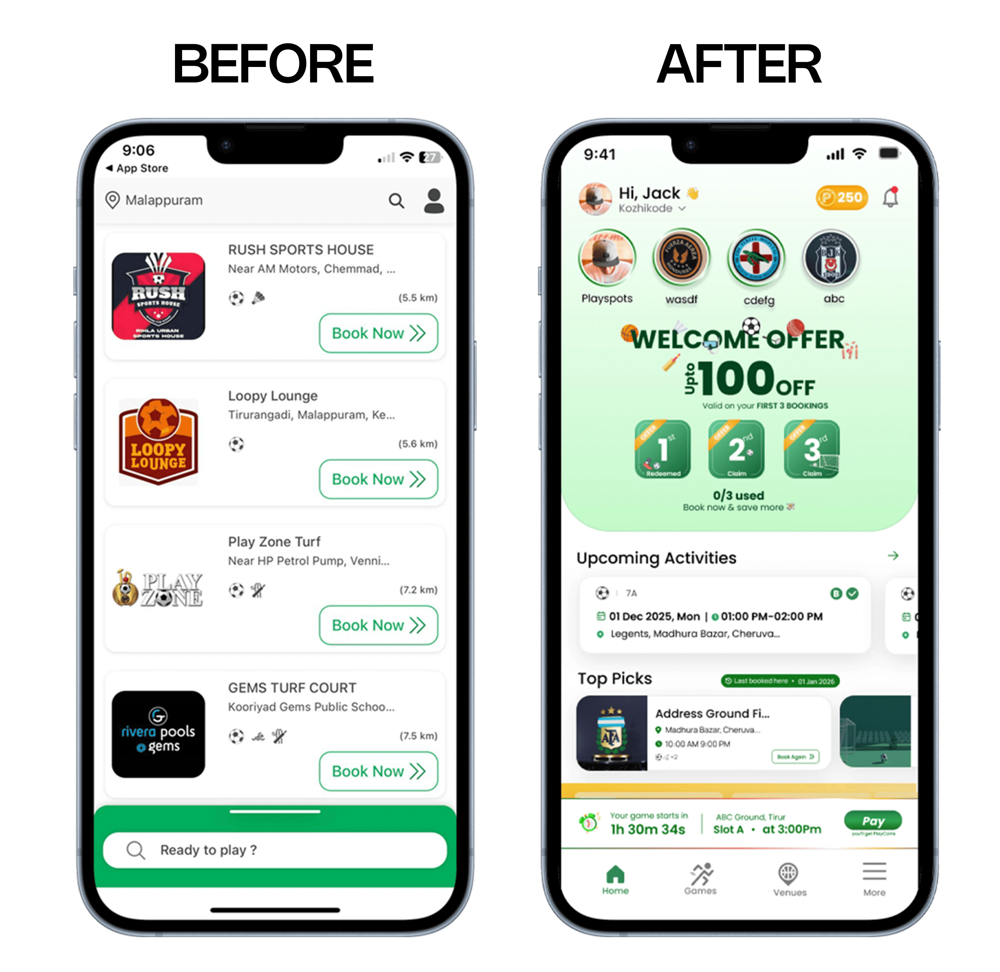
Redesigning the Home Screen
The home screen became much more than an entry point.
It became the place where users could make almost every important booking decision without searching through the rest of the application.
Every section was intentionally designed around something I learned during research.
The Stories section, for example, wasn't introduced simply because story interfaces are familiar. It solved a business problem.
Venue owners regularly wanted to promote discounts, tournaments, newly available slots, and facilities, but these updates often went unnoticed.
Giving venue owners a story-based publishing tool allowed them to communicate directly with users in a format people already understood, while helping users discover offers naturally during everyday app usage.
One of the strongest insights from research was how much users cared about rewards.
Many participants admitted they actively looked for discounts before deciding where to book.
That made me rethink how promotions should appear inside the application.
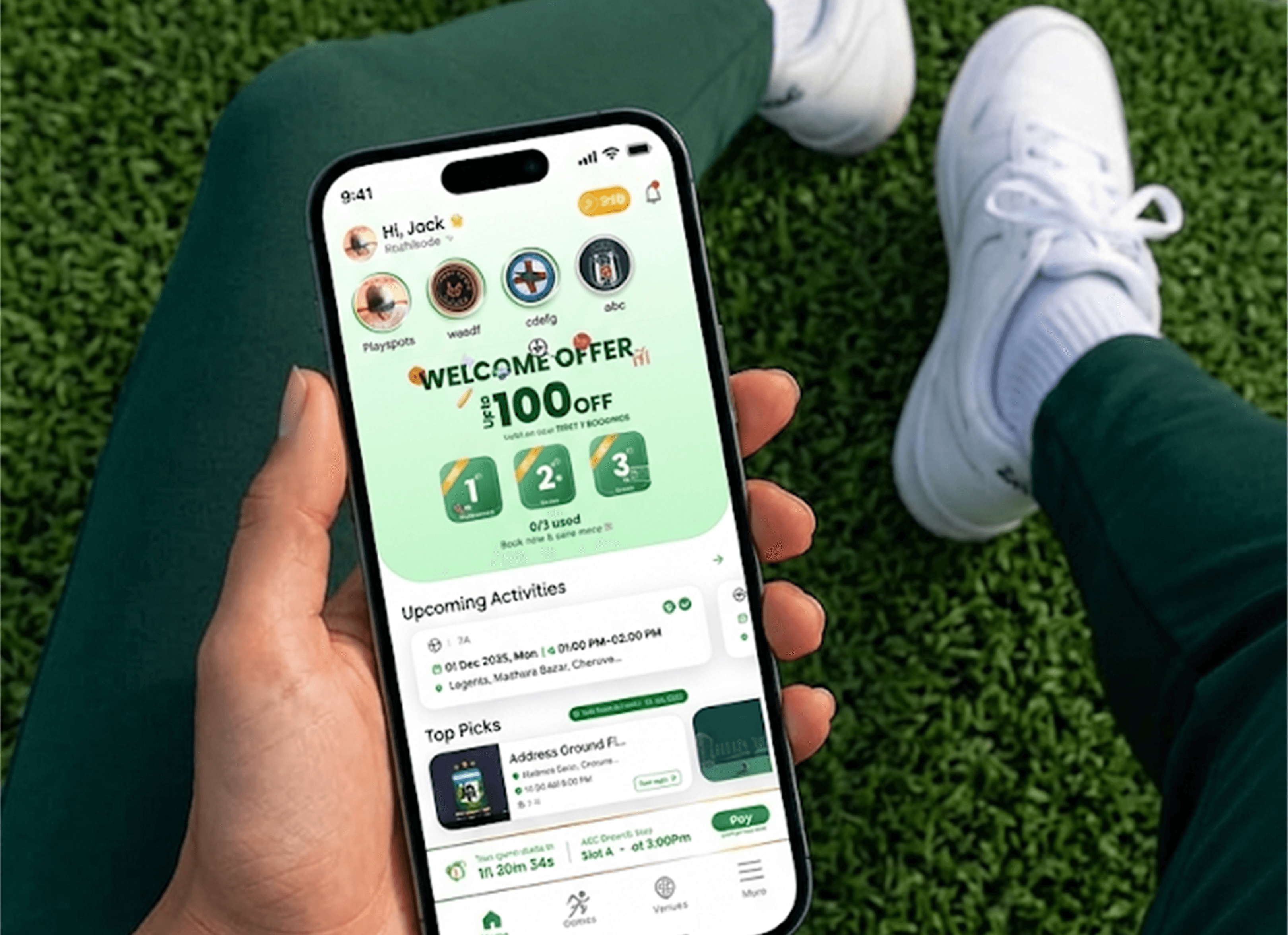
Instead of hiding the Welcome Offer inside another screen, I moved it into the hero section of the home page.
This immediately communicates value to first-time users and encourages repeat bookings by clearly showing that the reward can be redeemed across their first three bookings.
Rather than functioning as a marketing banner, it becomes part of the booking journey itself.
Another recurring pain point was that users frequently reopened the app simply to check their next booking.
Instead of making them navigate to another screen, I introduced an Upcoming Activities section directly on the home page.
With upcoming matches, venue information, booking time, and payment status visible immediately, users always know what's happening next without additional effort.
Visual Design
The redesign wasn't about making the interface look modern.
Every visual decision supported usability.
Green remained the dominant colour because it naturally communicates action, success, and sport while maintaining strong visibility for primary actions.
Large venue imagery helps users recognise locations quickly before reading detailed information.
Typography follows a clear hierarchy that allows users to scan availability, pricing, and booking details within seconds.
Spacing was intentionally increased throughout the interface to reduce cognitive load and improve readability, particularly during quick decision-making.
Rather than competing for attention, every visual element supports the booking journey.
Building a Scalable System
Because PlaySpots continues to evolve, consistency became just as important as aesthetics.
Instead of designing individual screens independently, I built a reusable design system that included buttons, booking cards, navigation patterns, chips, typography styles, spacing rules, colour tokens, and interaction states.
This made it easier to introduce new features while maintaining a consistent experience across the application.
Interactive prototypes in Figma were then used to validate the redesigned booking journey, helping the team review navigation, interactions, and user flow before development began.
Reflection
This project reinforced an important lesson about product design: good design begins with understanding the problem, not redesigning the interface.
Initially, it seemed that PlaySpots Lite mainly needed a visual refresh. However, after working closely with the product team, studying the existing platform, researching competitors, and speaking with users, it became clear that the real challenge wasn't the UI—it was the overall booking experience.
Every design decision, from restructuring the home screen to surfacing rewards and simplifying the booking flow, was driven by real user behaviour rather than personal preference. Designing for a live product also taught me how to balance business goals, technical constraints, and user needs while creating solutions that are both practical and scalable.
Key Learnings
Working on PlaySpots strengthened my understanding of designing products that solve real business and user problems simultaneously.
Throughout the project, I learned that:
Product decisions should always be supported by research rather than assumptions.
Small UX improvements, such as reducing clicks or improving information hierarchy, can have a significant impact on the overall user experience.
Understanding user motivation is often more valuable than adding new features.
Collaboration with developers and stakeholders early in the design process leads to more practical and scalable solutions.
Building reusable design systems and interactive prototypes accelerates iteration and improves consistency across the product.
Most importantly, I learned that successful product design is not about creating visually appealing screens, it's about designing experiences that help users achieve their goals with less effort.


